With New Year’s in the rear-view mirror and a bit of 2016 under our belts, it’s time to take a good look at what’s hot in interior design. Some of these trends require a long term commitment (you’re not going to update appliances every time style’s collective mind changes, after all.) Others are simple updates that can be swapped out when you tire of them.
Black stainless steel
From the telling activity level on Pinterest to the pages of design’s top magazines, there is one trend that consistently emerges: black stainless steel. Appliance manufacturers have created a finger-smudge resistant finish for this sleek new look, something anyone that’s tried to keep a stainless steel kitchen clean will appreciate. If the charcoal grey to outright ebony is too dark for your liking, take a look at bronze hues some brands offer. It’s a nice change from the traditional silver tones, yet not as dark as its black and grey cousins.
Rose Quartz and Serenity
Your home is your sanctuary. Pantone gets it, and that’s why they introduced paired Colors of the Year for 2016: Rose Quartz and Serenity Blue. The combo reflects “connection and wellness as well as a soothing sense of order and peace,” says Pantone. You don’t need to repaint a room with one, the other or both of these calm and collected tones to tap into the trend. These hues work well in accessories like area rugs, pillows and throws.
Cozy nooks
After a long day, you want to come home, kick your shoes off and get comfy. Right? Creating a cozy nook is something we can all get behind! Whether you build out your own reading nook or dedicate a sacred space for meditation, the goal is to carve out at least a small space to relax and recharge.
What’s new is old
From reclaimed wood to distressed finishes, the look of aged material adds texture and interest to your space. Tap into your inner DIY guru and have fun with this trend. For example, a refinished dresser with new pulls might make a one-of-a-kind buffet for your dining room. Pallets can be broken down and turned into everything from wall art to end tables. Get creative.
Pendant lights
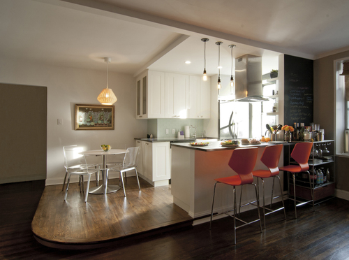
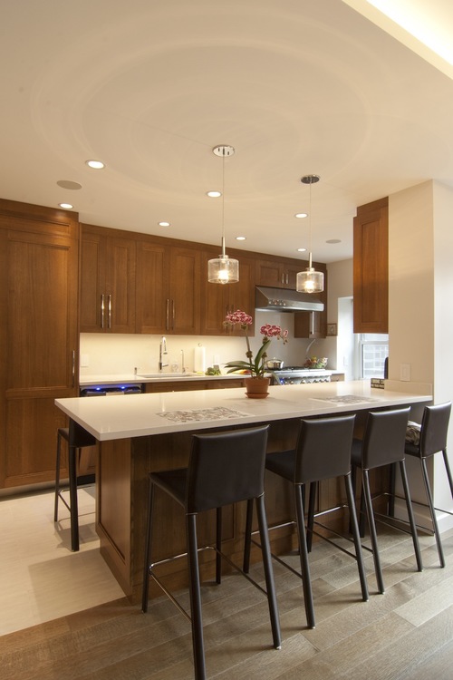
Big, beautiful chandeliers have their place, but this is the year of the pendant light. From modern to romantic these hanging gems are at home in the kitchen, as well as the bathroom, bedroom and any other space you want to dangle a little style from above.
Heated entry floors
Adding radiant heating to the floor is not entirely new. It’s become a popular bathroom splurge in recent years. The toe warming, chill shaking warmed floor is now finding its way into the entryways of your home. Just imagine pulling your snow covered boots or rain dampened shoes off on a toasty warm surface. Bliss!


