A Two-Bedroom Manhattan Apartment Receives a Mindful Renovation

featured this month on hunker by Kate Santos

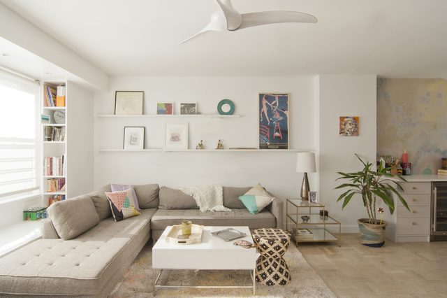
When a family of three sought to bring cohesion to their post-war apartment on Manhattan's Lower East Side, they called on architect Anjie Cho to give the two-bedroom address a more modern look. But when Cho answered their request to streamline the property, she also set out to do so from a thoughtful perspective — she also happens to be a feng shui expert. The owners and Cho decided that a simple design for their home was best, and they made it a priority to maximize the layout with a calm aesthetic. And since the site views the East River, Cho looked at that vantage point's natural light as an architectural prize that also serves a mindful purpose. "It's so important," she said. "Every living thing grows toward the light." Once the framework was established, Cho then moved on to a second challenge: clutter. "Some clutter is perfectly fine," she noted. "[But] if you've thought of tossing it more than nine times, then it's time to let it go." Now that the property has been updated and cleared of all unnecessary things, the family finally has a place to peacefully come together.

...read full article


Here's How to Bring This Kips Bay Co-Op Out of the 1960s - And Make The Most of Its Natural Light

featured this month on Brick Underground by Leah Hochbaum Rosner

The greatest thing this $879,000 Kips Bay one-bedroom at 300 East 33rd Street has going for it is an amenity you can't fake: natural light. “Those big windows are probably the best thing about this place,” says architect Anjie Cho, referring to the trio of floor-to-ceiling windows that overlook the condo building’s private garden. “It looks like it gets a lot of light.”

Yet while it’s bright and sun-drenched, the 1960s-era unit is being sold in as-is original condition, which means it could use a ton of work in order to whip it into shape. “The worst thing is probably that kitchen,” says Cho. “It’s so small. And when you look closer and see that there’s a column [that takes up a lot of room], it’s even smaller!”

Cho has a lot of ideas as to how to modernize this space. Below, her recommendations:

...read full article


Visit the Holistic Spaces Store

Experts Give Decorating Tips for the Minimalist

featured on Homeclick

Much of current modern design has gone the direction of a minimalist style. To understand exactly what that means and how to achieve a sense of artistry within this style, we’ve sought the advice of several design experts who have the experience to guide us.

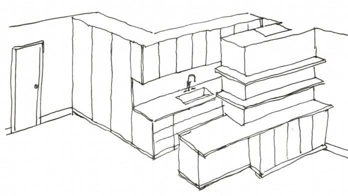
Architect Anjie Cho gives these tips related to building storage into a minimalist design: “It is best to have closed storage - minimize open shelving. Keeping things behind doors keeps the space clean, minimal and looking uncluttered. White storage against white walls, has the most minimal look. It's clean and sleek and blends into the wall.”

...read full article